Advertisement
Help Keep Boards Alive. Support us by going ad free today. See here: https://subscriptions.boards.ie/.
https://www.boards.ie/group/1878-subscribers-forum
Private Group for paid up members of Boards.ie. Join the club.
Private Group for paid up members of Boards.ie. Join the club.
Hi all, please see this major site announcement: https://www.boards.ie/discussion/2058427594/boards-ie-2026
Google's new favicon
-
09-01-2009 11:49PM#1
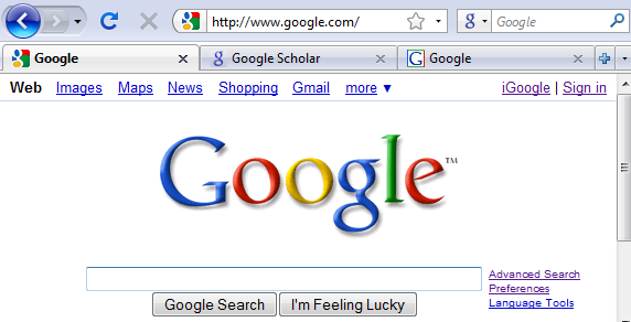
 Google's new favicon
 by André Resende
 by Hadi Onur Demirsoy
 by Lucian E. Marin
 by Yusuf Sevgen
Comments
Advertisement