Advertisement
If you have a new account but are having problems posting or verifying your account, please email us on hello@boards.ie for help. Thanks :)
Hello all! Please ensure that you are posting a new thread or question in the appropriate forum. The Feedback forum is overwhelmed with questions that are having to be moved elsewhere. If you need help to verify your account contact hello@boards.ie
April 2012 heats up as 5th warmest month globally
Options
-
18-05-2012 8:19pm#1Well I'm glad at least some parts of the world enjoyed a warm April :rolleyes:
Interesting that April turned out to be so exceptionally warm when so much of the UK, Ireland, North West Europe and Scandinavia were so cool.
The last time the globe had a month that averaged below the 20th Century normal was February 1985. April makes it 326 months in a row. Nearly half the population of the world has never seen a month that was cooler than normal, according to United Nations data. :eek:
This really is crazy when you think how many below average months we've had temperature wise in Ireland over the past five years or so, at least in parts of the East.
Full article here:
http://weather.yahoo.com/april-2012-heats-5th-warmest-month-globally-151818867.html1
Comments
-
I think 'normal' isn't really normal if it hasn't been round in nearly 30 years!0
-
The figures are cooked... all of Ireland in red showing above temperatures based upon 71-00 data... our own Met says we were 1c colder than 61-90 data...
http://www.ncdc.noaa.gov/sotc/service/global/map-blended-mntp/201204.gif <<< cooked map with Ireland clearly in red...
http://www.met.ie/climate/monthly_summarys/apr12sum.pdf <<< Met Eireann's honesty...
Keep paying the carbon taxes folks. :rolleyes:0 -
Are you reading the graph correctly? The article clearly says
Last month was the third hottest April in the United States and unusually warm in Russia, but cooler than normal in parts of western Europe.
:rolleyes:0 -
The figures are cooked... all of Ireland in red showing above temperatures based upon 71-00 data... our own Met says we were 1c colder than 61-90 data...
http://www.ncdc.noaa.gov/sotc/service/global/map-blended-mntp/201204.gif <<< cooked map with Ireland clearly in red...
http://www.met.ie/climate/monthly_summarys/apr12sum.pdf <<< Met Eireann's honesty...
Keep paying the carbon taxes folks. :rolleyes:
Actually, based on the Met Eireann Summary, we were only 0.66C below the 1961-1990 average, so careful not to cook that data!
The NOAA anomaly map you linked to is based in land and sea surface temperature anomalies. So while the surface air temperatures around Ireland averaged a little below normal, the sea surface temperatures averaged above normal for the month, resulting in a slightly above average month overall. Hence the small red dot (<1C) for the Ireland region.0 -
The raw data globally display three characteristics worth noting, in my humble opinion.
First, they have gone more or less steady-state since about 2002. The rise in global temperatures was at its highest rate between 1986 and 1997. After a peak with the 1997-98 El Nino (at about 0.5 C above 1951-80 which is the normal period used in the data in my link) there was a bit of a downturn in the years 1999 to 2001, but since 2002 most years have come in between 0.45 and 0.65.
Second, the regional differences are noticeable and the subarctic is warming more than other regions.
Third, the data set itself has some dubious reliability issues, in that some stations could be contaminated by urban heat island effects, which are certainly "anthropogenic warming" but not of the kind being postulated in the AGW theory.
Here's the link, the data can only be used to illustrate the first of my three contentions above.
http://data.giss.nas...GLB.Ts dSST.txt
As to the distinction between greenhouse warming and urban heat island effects, it should be noted that the two are not mutually exclusive. The way that an urban heat island operates is that it tends to build up over several days, then it becomes dispersed by stronger winds in cloudy daytime weather in particular. But that heat does not vanish, it is incorporated into the global atmosphere. Some of its origin is of greenhouse variety and some is due to albedo changes (surface reflectivity) due to the relatively dark surfaces of large urban areas (this traps and stores heat). I estimate that about one third to one half of reported warming, if true (some of the data could be compromised by site changes), is from mixing of urban heat island warming rather than global greenhouse processes.
The other unknown is to what extent the cause and effect is in the direction implied (greenhouse gas causes warming) and not in the other direction (warmer atmosphere induces greater releases of greenhouse gases). This is important in the consideration of how natural variability and AGW interact. If a natural cooling cycle reversed the upward temperature trend, then that might feed back into the greenhouse gas production rate, especially for methane in melting areas of the subarctic.
In other words, it is all complicated, and tends to be a more subtle process than the media would have us believe. The past five years in Ireland and the UK reveal just how fragile this "global warming" can be, I don't have ready access to Irish data but I recall posting elsewhere a study showing that the period 1988-2007 had warmed by 1.2 C relative to long-term CET but that had fallen back to 0.4 C in 2008-11 inclusive. That is similar to 1971-87, so it appears that a peak has been reached and passed in some ways. The last year or two in North America on the other hand have seen a return to near-record warmth in many places, similar to peaks around 1990 and 1998.
I think this situation is on the borderline between significant and random, and could yet go either way, because natural variability is probably two or three times stronger than the AGW signal, and can push it around almost at will. We found that out big-time in December 2010.0 -
Advertisement
-
Good post MTC, and you've got some valid points there. Assuming none of us are climate scientists, so I'll give my own humble opinion on this.M.T. Cranium wrote: »The raw data globally display three characteristics worth noting, in my humble opinion.
First, they have gone more or less steady-state since about 2002. The rise in global temperatures was at its highest rate between 1986 and 1997. After a peak with the 1997-98 El Nino (at about 0.5 C above 1951-80 which is the normal period used in the data in my link) there was a bit of a downturn in the years 1999 to 2001, but since 2002 most years have come in between 0.45 and 0.65.
The global temperatures do seem to have turned somewhat steady since 1997. That time also coincides with with a switch towards a -ve PDO and a more La Nina dominant setting, along with a continued long term downward trend in sunspots and a downward trend in the NAO. I think much of that can go towards explaining the flat lining global temperatures.M.T. Cranium wrote: »Second, the regional differences are noticeable and the subarctic is warming more than other regions.
Can't argue with that!M.T. Cranium wrote: »Third, the data set itself has some dubious reliability issues, in that some stations could be contaminated by urban heat island effects, which are certainly "anthropogenic warming" but not of the kind being postulated in the AGW theory.
The trend with urban stations is the same as the trend in rural locations and the UHI is accounted for when generating the published data.M.T. Cranium wrote: »Here's the link, the data can only be used to illustrate the first of my three contentions above.
http://data.giss.nas...GLB.Ts dSST.txt
The link is broken, but I presume it's just the global temperature data yes?M.T. Cranium wrote: »As to the distinction between greenhouse warming and urban heat island effects, it should be noted that the two are not mutually exclusive. The way that an urban heat island operates is that it tends to build up over several days, then it becomes dispersed by stronger winds in cloudy daytime weather in particular. But that heat does not vanish, it is incorporated into the global atmosphere. Some of its origin is of greenhouse variety and some is due to albedo changes (surface reflectivity) due to the relatively dark surfaces of large urban areas (this traps and stores heat). I estimate that about one third to one half of reported warming, if true (some of the data could be compromised by site changes), is from mixing of urban heat island warming rather than global greenhouse processes.
That's true, while every uncertainty cannot be accounted for with regard the UHI effect, I think most climate scientists have a pretty good handle on it. As I mentioned earlier, the trend is the same in rural and urban areas. Also, if it was contributing significantly to global temperatures, we'd expect to see more industrialised areas with the largest +ve temperature anomalies, which just isn't the case.M.T. Cranium wrote: »The other unknown is to what extent the cause and effect is in the direction implied (greenhouse gas causes warming) and not in the other direction (warmer atmosphere induces greater releases of greenhouse gases). This is important in the consideration of how natural variability and AGW interact. If a natural cooling cycle reversed the upward temperature trend, then that might feed back into the greenhouse gas production rate, especially for methane in melting areas of the subarctic.
We know that the oceans have absorbed roughly a third of anthropogenic CO2 emissions, as we can see with the ocean acidification issue. The human produced CO2 I think can be identified by the isotope ratio between C12 and C13. The feedback mechanisms do exist, such as in the Arctic and subarctic as you mentioned, with rises in methane from destabilisation of shallow ocean hydrates and melting permafrost among others.M.T. Cranium wrote: »In other words, it is all complicated, and tends to be a more subtle process than the media would have us believe. The past five years in Ireland and the UK reveal just how fragile this "global warming" can be, I don't have ready access to Irish data but I recall posting elsewhere a study showing that the period 1988-2007 had warmed by 1.2 C relative to long-term CET but that had fallen back to 0.4 C in 2008-11 inclusive. That is similar to 1971-87, so it appears that a peak has been reached and passed in some ways. The last year or two in North America on the other hand have seen a return to near-record warmth in many places, similar to peaks around 1990 and 1998.
I think this situation is on the borderline between significant and random, and could yet go either way, because natural variability is probably two or three times stronger than the AGW signal, and can push it around almost at will. We found that out big-time in December 2010.
In my opinion, the last 5 years show how fragile our weather can be, not global warming. The short term drops in the CET and Irish temperature you mentioned are what I'd consider weather also, rather than indicative of climate. While it perhaps isn't of much importance globally, the trend for Ireland has largely followed the global trend. http://www.met.ie/climate-ireland/surface-temperature.asp
While future predictions contain some uncertainty, to me it seems clear that warming the last century, especially the last 50 years, has been driven much more so by man made CO2 than anything else
So on the whole, I'll have to respectfully disagree with you:)0 -
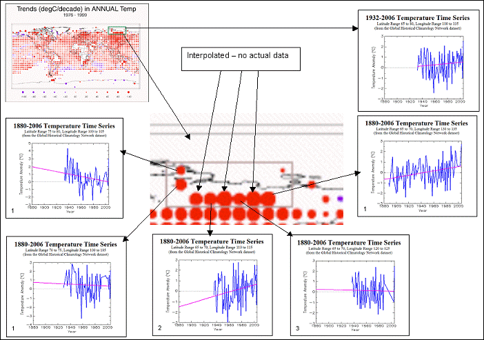
Not to mention the fact that in areas that have no data, they interpolate and calculate a value that invariably gives a warm trend. See hereThe following figure shows temperature trends for the Siberian area highlighted previously (Lat 65 to 80 - Long 100 to 135). Of the eight main temperature dots on the IPCC map, three are interpolated (no data). Of the five with data, the number of stations is indicated in the lower left corner of each grid-based temperature graph. The only grid with more than two stations shows no warming over the available data. The average for the entire 15 x 35 degree area is shown in the upper right of the figure. Of the eight individual stations, only two exhibit any warming since the 1930’s (the one in long 130-135 and only one of the two in long 110-115). An important issue is to keep in mind is that in the calculation of global average temperatures, the interpolated grid boxes are averaged in with the ones that actually have data. This example shows how sparse and varying data can contribute to an average that is not necessarily representative.
Areas of the Sahara are also given false warm anomalies.0 -
This really is crazy when you think how many below average months we've had temperature wise in Ireland over the past five years or so, at least in parts of the East.
We've had very few cooler than average months really over the last 5 years, although they do seem to have increased in frequency since Nov 2009 oddly enough.0 -
Speaking of the urban heat island effect, here is a Brazilian article from a couple of years ago (in Portuguese) which highlights the fact that, apart from large cities (such as São Paulo, Rio de Janeiro, Buenos Aires, Curitiba, etc), there is no warming trend in South America over the past several decades. The author also states that, even in the large cities, the individual warmings started when these cities underwent large growth. He claims that these facts have been hidden from the public.
http://www.metsul.com/secoes/visualiza.php?cod_subsecao=33&cod_texto=5570 -
Speaking of the urban heat island effect, here is a Brazilian article from a couple of years ago (in Portuguese) which highlights the fact that, apart from large cities (such as São Paulo, Rio de Janeiro, Buenos Aires, Curitiba, etc), there is no warming trend in South America over the past several decades. The author also states that, even in the large cities, the individual warmings started when these cities underwent large growth. He claims that these facts have been hidden from the public.
http://www.metsul.com/secoes/visualiza.php?cod_subsecao=33&cod_texto=557
I'm not sure whether it's the translation or just poorly done, but it seems the scales keep changing on the graphs in that article, there are no trend lines used and the author only mentions urban expansion times in particular cities and gives little explanation as to why. Also, using only 20 stations to represent an entire continent isn't really representative, and even if we give it the benefit of the doubt and say it's correct, then it should also be observable across the rest of the world.
These climate scientists aren't all idiots and would have noticed such an obvious pattern by now.
As for the title claiming the data is being hidden, I'm pretty sure with all the sceptical websites and organisations out there, if something like this was real and mattered, we'd be hearing all about it now!0 -
Advertisement
-
Deep Easterly wrote: »We've had very few cooler than average months really over the last 5 years, although they do seem to have increased in frequency since Nov 2009 oddly enough.
Well Dublin Airport has had 7 since January 2011 alone and Casement has had 5 - that seems a large enough number to me. I can't comment on Ireland as a whole however.0 -
But yet when a map shows warming, it's infilled data is allowed to stand? Double standards much?...using only 20 stations to represent an entire continent isn't really representative, and even if we give it the benefit of the doubt and say it's correct, then it should also be observable across the rest of the world.
Certainly not... if I was paid to find global warming... i'd damn well find it. This quango survives on grant aid you know.These climate scientists aren't all idiots and would have noticed such an obvious pattern by now.
You are hearing about it now.As for the title claiming the data is being hidden, I'm pretty sure with all the sceptical websites and organisations out there, if something like this was real and mattered, we'd be hearing all about it now!0 -
Well Dublin Airport has had 7 since January 2011 alone and Casement has had 5 - that seems a large enough number to me. I can't comment on Ireland as a whole however.
Pretty much the same trend over the rest of the country but I would be cautious about comparing Dublin Airport's recent data against its long-term means as was discussed on this thread last year.0 -
But yet when a map shows warming, it's infilled data is allowed to stand? Double standards much?
What? If we're talking about the NOAA maps, they use optimal interpolation. I don't know what weighting they use in the different parameters, so rather than jump to conclusions, I'll choose not to comment on it until I understand the methods a bit better.
But I can understand how that might seem like too much effort to some.Certainly not... if I was paid to find global warming... i'd damn well find it. This quango survives on grant aid you know.
All scientists, in every field of study, are paid by somebody.
Do you question whether cancer is real because drug companies pay scientists to investigate the causes, cures and treatment for it?
If there were fundamental flaws in the work, it would be pointed out. Instead, oversimplifications are made, lies and propaganda are distributed and all the while little or no scientific evidence is out there against man made global warming.You are hearing about it now.
The article is from 2007, I'm sure the author could have created a scientific paper with it if it had any real scientific basis.
While we're at it, is it the global warming you don't believe to have occurred, or just that CO2 ain't the cause?0 -
I had this debate on another forum back in 2007 and I got the same dismissive replies, with people dodging the fact that in a wide expanse of South America, only the large cities are showing a warming trend. The scale of the charts has nothing to do with it, and in any case they all have data for the past 50 years. You don't need trend lines to see the difference. That again is dodging the issue.
Say we had seen Pheonix Park showing a warming trend but Casement, Dublin Airport, Oak Park and Mullingar without it. Would you then say the same thing? Different part of the world but the same scenario. Would you say Ireland (or at least Leinster) was warming or not? Wouldn't the Pheonix Park data look a little suspicious? The same thing is really happening in Brazil and Argentina, so deal with that real issue.0 -
I had this debate on another forum back in 2007 and I got the same dismissive replies, with people dodging the fact that in a wide expanse of South America, only the large cities are showing a warming trend. The scale of the charts has nothing to do with it, and in any case they all have data for the past 50 years. You don't need trend lines to see the difference. That again is dodging the issue.
You're doing a fine job of dismissing the points I made.
A) Why does the author only describe periods of rapid urban expansion for some areas and not others and where are the sources? His description of the trends in the graphs often don't match what the graphs actually show.") Scale does matter. For example, why is the Rio graph cut off before 2000 without explanation? Look at x axis scales, why so much variety? If he's gonna rely on crude visual comparisons, at least make the graphs comparable!
Scale does matter. For example, why is the Rio graph cut off before 2000 without explanation? Look at x axis scales, why so much variety? If he's gonna rely on crude visual comparisons, at least make the graphs comparable!
C) Many areas where he claims a neutral or cooling trend, look much more to me like a slow rising or flat trend, hence a trend line would help, and if he was somehow accurate in his assertions it couldn't hurt, could it?
D) This is supposed to be some kinda scientific refutation of CO2 induced climate change. So why not make his work more scientific? Use a larger data set, show sources, expand his ideas to other continents. Why rely on eye-balling a handful of graphs? The power of suggestion can do wonders!Say we had seen Pheonix Park showing a warming trend but Casement, Dublin Airport, Oak Park and Mullingar without it. Would you then say the same thing? Different part of the world but the same scenario. Would you say Ireland (or at least Leinster) was warming or not? Wouldn't the Pheonix Park data look a little suspicious? The same thing is really happening in Brazil and Argentina, so deal with that real issue.
That would be something, but it's not happening. If the authors assertions were true, then that is the pattern we'd expect to be the norm all around the world, but it isn't.
C'mon Su, science has moved beyond the realms of eye-balling graphs. When someone with as clear and obvious a bias as can be seen in the article tries to give evidence against something as well accepted as CO2 causing warming, they really need to be scientific and systematic about it.
Even if the article was true, it would not come close to refuting global warming by CO2, only a demonstration on UHI and regional variation.0 -
The author does NOT deny warming is occuring around the world, and the graphics not his, they are from NASA. I speak Portuguese so I will translate it properly, so we don't have to rely on Google translate.[FONT=trebuchet ms,geneva][/FONT][FONT=trebuchet ms,geneva]
First of all, I would like to reiterate my stance on whether global warming is an unquestionable fact. Not one piece of data exists that supports the claims of those who deny the warming of the planet in the last 30 years. On the other hand, I reiterate my understanding that such warming has occured through well descernable natural causes and t[/FONT][FONT=trebuchet ms,geneva]he future scenario is not[/FONT][FONT=trebuchet ms,geneva] frightening and hopeless, as is suggested in the recent media and scientific hysteria. What you are about to read in this post are facts and data proportionate with an institution well known for its scientific rigour[/FONT][FONT=trebuchet ms,geneva], and the graphics that follow were not produced by MetSul Meteorologia or by me personally, but by an independent third party.
NASA is an institute that is above any suspicion when it comes to scientific knowledge and excellence. Among its staff is Jim Hansen, one of the biggest and oldest supporters of these scare stories, and who claims to have been censured by the White House for his beliefs. The institution run by Hansen in NASA has a wealth of historical temperature records for stations right throughout the world. These data are used in the Global Climate Models that project these cataclysmic scenarios for the next decades, so the precision of these data must be very high to prevent distortion in the numerical forecast data.
[/FONT][FONT=trebuchet ms,geneva]
This analysis will concentrate on South America as this is of most interest to us. It deals with one of the areas least likely to suffer the harmful consequences forecast by the scientists who defend the catastrophic scenarios. If we are in global warming, what better than to have a look at how much the region has warmed by. The NASA graphic for São Paulo leaves no doubt that the Paulista capital has undergone remarkable warming during the 20th century, something that will feed the claims of those who post a bleak outlook for humanity.
[/FONT][FONT=trebuchet ms,geneva]Another enormous metropolitan area that could be an example of global warming is Rio de Janeiro, which shows a strong rise in temperature since the 40s. The values, however, show a leveling off since the start of the 60s.
While Rio showed this leveling off, Curitiba, on the other hand, showed strong warming starting around the same time.
Are these strong temperature rises in these three cities eveidence of global warming? The answer is a big fat no. [/FONT][FONT=trebuchet ms,geneva]It can be noted from the graphs that the warming starts at completely distinct periods. São Paulo warms from the end of the 1900s, when there weren't thousands of cars emitting their greenhouse gases. Rio warmed until the 40s, then leveled off. Curitiba only started warming from the end of the 50s. Global warming does not explain these temperature trends; urbanisation does. Urban expansion took place in different forms and at different times in these cities, with São Paulo witnessing an exponential building growth at the start of the 20th century. Rio underwent the same process, but topographical limitations impeded further horizontal growth, which is reflected in the growth of Grande Rio, and not exactly in the city of Rio, which is wedged between Serra Geral and the sea. Even Curitiba, like the other cities, underwent accelerated growth from the middle of the century. If the cause was Global Warming, why did the warming start in different decades in the different cities?[/FONT][FONT=trebuchet ms,geneva]
The theory is confirmed by the temperature behaviour in Porto Alegre. In the last 100 years, the temperature of the Gaucho capital shows no great variation. In the last 50 years, when the weather station was located in a green area (Botanical Gardens), there was no significant change in temperature patterns. The large vegetation cover around the station mitigated the effects of the urbanisation observed during the 20th century and esplains the stability.
I could go on, but there's no point spending an hour translating it. The key answers to your questions are:
[/FONT]- [FONT=trebuchet ms,geneva]He concentrated on South America as that is his key audience. [/FONT]
- [FONT=trebuchet ms,geneva]The graphics are from NASA, so not his, and therefore he cannot put in an accurate trendline.[/FONT]
- [FONT=trebuchet ms,geneva]The growth of each city quoted is obviously there for anyone to look up, so there is no reason to doubt his dates.[/FONT]
This is a blog, not a scientific paper. However, I have no reason to believe that the data are not correct. They are from NASA, which you claim above use "optimum" processess. I disagree with your argument that the trends are not what he claims. Eyeballing is accurate enough in this case to see the huge differences. "Level" may not be exactly level, alright, but it is clear that they are level when compared to the large cities. It would be interesting to see the same thing expanded to other parts of the world. I have seen similar for the States, where many of the climate stations are in ludiricous locations, such as tarmac carparks, near air conditioning outlets, etc.
[/FONT]0 -
The author does NOT deny warming is occuring around the world, and the graphics not his, they are from NASA. I speak Portuguese so I will translate it properly, so we don't have to rely on Google translate.
[/I]
I could go on, but there's no point spending an hour translating it. The key answers to your questions are:
[/SIZE][/FONT]- [FONT=trebuchet ms,geneva]He concentrated on South America as that is his key audience. [/FONT]
- [FONT=trebuchet ms,geneva]The graphics are from NASA, so not his, and therefore he cannot put in an accurate trendline.[/FONT]
- [FONT=trebuchet ms,geneva]The growth of each city quoted is obviously there for anyone to look up, so there is no reason to doubt his dates.[/FONT]
This is a blog, not a scientific paper. However, I have no reason to believe that the data are not correct. They are from NASA, which you claim above use "optimum" processess. I disagree with your argument that the trends are not what he claims. Eyeballing is accurate enough in this case to see the huge differences. "Level" may not be exactly level, alright, but it is clear that they are level when compared to the large cities. It would be interesting to see the same thing expanded to other parts of the world. I have seen similar for the States, where many of the climate stations are in ludiricous locations, such as tarmac carparks, near air conditioning outlets, etc.
[/FONT]
First off, I never said he denied global warming, just CO2 induced warming.
Also, he shows a large number of city graphs, with a general upward temperature trend. Their not all the same trend... thus CO2 isn't causing global warming?... where is the logic in that? Nobody has ever said every region of the world has to warm at exactly the same rate.
So saying that because the temperature trend in a number of cities, separated by thousands of km, isn't identical - he claims that as a no for CO2 warming.
He even claims that while Rosario shows warming, 2 nearby cities, Concord and Paso de Los Libres, the temperature is steady, thus showing the warming in Rosario to be due to urbanisation. Concord and Paso de Los Libres are about 1,000km and 500km from Rosario respectively and both much further inland. If we were analysing temperature trends in say Edinburgh, we wouldn't use Oslo and Reykjavik for comparison.
He compares selective temperatures trends with cherry picked and vague urban expansion descriptions. That is not very scientific in my opinion. As for going after the sources myself to prove him right or wrong, my response to that would be that the onus lies with the author to back up his claims with data and references, not the reader.
As for the temperature data, if that was the best he could do then fine. But, how many stations did he leave out? How many cities did he leave out? Why not include descriptions of the station locations for all cities rather than just 1 when it suited him? Why only use such a small area of S. America? Does the rest of the data not fit the agenda? Are there any rural stations? Why not request the actual data rather than just graphs? And so on and so on...
Here is a screen shot of the cities used in the article, green for no trend or decline (only 1 or 2 clear declines) and red for increasing temperatures, just to show the kind of area he used.
I honestly believe that the blog post is about secondary school geography level analysis. I know that kinda thing certainly wouldn't get me more than a pass (if lucky) in Uni!
Anyway, I can see why few people have paid much attention to the article/blog. Apologies if all this makes me appear dismissive, I just don't think it is up to standard to be honest.0 -
Instead, oversimplifications are made, lies and propaganda are distributed and all the while little or no scientific evidence is out there against man made global warming.
That's quite the bold statement.
If it is accepted that cities cause a 'warm island effect' why is their Data accepted at all for these studies. Why not judge global warming exclusively on mountain stations and weather ballons?
Like with all popular opinions, the people who hold them take a higher ground, a calling that they have answered (That's what they come across like, not all tho") )
)
There is far too much money in GW research to accept any of it at this stage, If the Nat-Geo channel didn't pump it out so hard, I may take more seriously....
Bring back the hole in ozone layer scare....0 -
That's quite the bold statement.
If it is accepted that cities cause a 'warm island effect' why is their Data accepted at all for these studies. Why not judge global warming exclusively on mountain stations and weather ballons?
Like with all popular opinions, the people who hold them take a higher ground, a calling that they have answered (That's what they come across like, not all tho )
There is far too much money in GW research to accept any of it at this stage, If the Nat-Geo channel didn't pump it out so hard, I may take more seriously....
Bring back the hole in ozone layer scare....
The urban heat island effect is accounted for, and adjustments are made to counter the effects. For most long term stations, the trend in the same for both rural and urban settings.
There is money involved in all research, climate science is no different. Though it's not like the hydrocarbon industry, which stands to lose the most from any CO2 restrictions, is in any way short of cash! But because they cannot find any scientific basis on which to produce countering scientific evidence, they resort to tactics ranging from spreading a stance of "no scientific consensus" myth, to billboards such as these
Hence the "bold" statement I made!0 -
Advertisement
-
You don't seem to be getting it. This is not a scientific paper, it's a blog, and like most blogs it is a short concise piece, not 10 or 20 pages of indepth peer-reviewed scientific analysis with references. He therefore takes a sample of the main cities of the continent, as they are of most interest to his readers and I'm sure he doesn't have 6 months or a year to dedicate to writing a full paper. I'm not sure how extensive the climate dataset is for that part of the world, so there may not be too many stations to choose from in the first place.
My point is that most stations around the world have become urbanised in recent decades, with rural station becoming rarer and rarer. He shows examples of differences between large urban centres and more rural locations. Global temperature anomaly maps show warming for South America, but these would be contaminated by the false warmings of the large cities. Take these data out and you may get a very different result. The period of interest is since the 60s, as this is when the CO2 warming is claimed to have taken place. If CO2 is indeed doing as nasty a job as we're being led to believe, then we should see every rural station showing warming too, with a common baseline trend behind local factors. Your map is not as reliable as you make out. You have left out Concordia altogether. You have a warming trend for Rocha and Trelew, when in fact they are level since the 60s and 40s, respectively). Correct that and the graph will look very different.
Most warming is claimed to occur in the northern hemisphere, which, coincidentally, is where the majority of populated areas and hence biased warmings are. With these cities growing and more and more rural stations being stepped down, it is no wonder that the data are being made look worse than they actually are. No doubt that the earth has warmed in the last few decades of the 20th century, but it's strange how it has leveled off in the last one. PDO turning negative and lower solar activity are the obvious reasons, but no one seems to want to entertain that fact.0 -
You don't seem to be getting it. This is not a scientific paper, it's a blog, and like most blogs it is a short concise piece, not 10 or 20 pages of indepth peer-reviewed scientific analysis with references. He therefore takes a sample of the main cities of the continent, as they are of most interest to his readers and I'm sure he doesn't have 6 months or a year to dedicate to writing a full paper. I'm not sure how extensive the climate dataset is for that part of the world, so there may not be too many stations to choose from in the first place.
My point is that most stations around the world have become urbanised in recent decades, with rural station becoming rarer and rarer. He shows examples of differences between large urban centres and more rural locations. Global temperature anomaly maps show warming for South America, but these would be contaminated by the false warmings of the large cities. Take these data out and you may get a very different result. The period of interest is since the 60s, as this is when the CO2 warming is claimed to have taken place. If CO2 is indeed doing as nasty a job as we're being led to believe, then we should see every rural station showing warming too, with a common baseline trend behind local factors. Your map is not as reliable as you make out. You have left out Concordia altogether. You have a warming trend for Rocha and Trelew, when in fact they are level since the 60s and 40s, respectively). Correct that and the graph will look very different.
Most warming is claimed to occur in the northern hemisphere, which, coincidentally, is where the majority of populated areas and hence biased warmings are. With these cities growing and more and more rural stations being stepped down, it is no wonder that the data are being made look worse than they actually are. No doubt that the earth has warmed in the last few decades of the 20th century, but it's strange how it has leveled off in the last one. PDO turning negative and lower solar activity are the obvious reasons, but no one seems to want to entertain that fact.
Scientific papers don't take up many pages usually, and seen as this type of analysis should be straight forward, it could probably be done in a few days or less. So considering all the information that is completely lacking, the sources that are lacking, the empirical data that's lacking, and the relatively small area and seemingly arbitrary station choices, I'll stick with it not being up to anywhere near the standard to justify the title "Why is this information being hidden?"
The UHI is accounted for and urban and rural stations display the same trend. The northern hemisphere is warmer because of the larger land mass, the melting Arctic sea ice and the fact that we've less ice sheet cover than the southern hemisphere. The industrialisation aspect is accounted for and besides, satellite data show warming is occurring now as well.
These stations in the blog are so far apart and we know so little about how they were chosen that its not safe to make any conclusions. Regional variation can be impressive!
As for my map, I'm not making any big claims with it! I definitely included some city called Concordia, though perhaps not the right one? I also used my own interpretation of the graph trends, seeing as I disagreed with many of the ones decided on by the author.
As for your last paragraph, if UHI is driving so much of global temperatures, why did they peak in the late nineties? And seen as the last 15 years we've been on a downward trend in sea ice, snow cover, PDO, ENSO, NAO and a long term solar decrease, why are we only managing to barely flatline global temperatures? Not even a slight decrease like the 0s to 70s.
Also, plenty of studies are being done and have been done of the affects of solar activity and ocean cycles/oscillations. Just because they don't appear across the mainstream media doesn't mean they don't exist.
Do you think CO2 has no warming effect at all?0 -
There is money involved in all research, climate science is no different. Though it's not like the hydrocarbon industry, which stands to lose the most from any CO2 restrictions, is in any way short of cash! But because they cannot find any scientific basis on which to produce countering scientific evidence, they resort to tactics ranging from spreading a stance of "no scientific consensus" myth,
You have like so many missed most of the counter argument.
Counter argument being, prove global warming is man made.
Currently it can't be done. We don't know what the weather 'should be like' As with most fields of science, it is now totally unacceptable to say 'we don't have an answer'.
An answer has to be given. Hence global warming.
As for the Hydro Carbon industry. What's to be scared of, wind energy, solar, energy, hydro? All are laughable. Dirtier than they are clean.
Sea levels are always thrown out there to be on the rise
http://www.agu.org/pubs/crossref/2007/2006GL028492.shtml
A time comes when you say enough is enough0 -
As for your last paragraph, if UHI is driving so much of global temperatures, why did they peak in the late nineties? And seen as the last 15 years we've been on a downward trend in sea ice, snow cover, PDO, ENSO, NAO and a long term solar decrease, why are we only managing to barely flatline global temperatures? Not even a slight decrease like the 0s to 70s.
Also, plenty of studies are being done and have been done of the affects of solar activity and ocean cycles/oscillations. Just because they don't appear across the mainstream media doesn't mean they don't exist.
Do you think CO2 has no warming effect at all?
So quote some of these articles to back up your argument then, like you say he should have done. :cool:
The leveling of the last 10-15 years (which was not forecast by the hockey-stick models by the way) is probably in some part down to the thermal inertia of the oceans, which are continuing to release some heat built up in the previous decades' solar activity, and also the continued urbanisation of stations. No doubt the globe has warmed, as it always has and will, but I don't feel that it has as much as is being claimed. The global warming of the early 20th century is identical in slope and scale to the warming since the start of the 70s, but the earlier one was put down to solar activity. It was followed by 20-30 years of leveling. We are seeing an identical pattern emerging now, with warming from the 70s, and leveling since the late 90s. We have a much larger population now, with infinitely more car and plane journeys, so we really should not be seeing leveling if CO2 is the main culprit. It does have a small radiative forcing, but is dwarfed by that of H2O and other factors.0 -
You have like so many missed most of the counter argument.
Counter argument being, prove global warming is man made.
Currently it can't be done. We don't know what the weather 'should be like' As with most fields of science, it is now totally unacceptable to say 'we don't have an answer'.
An answer has to be given. Hence global warming.
As for the Hydro Carbon industry. What's to be scared of, wind energy, solar, energy, hydro? All are laughable. Dirtier than they are clean.
Sea levels are always thrown out there to be on the rise
http://www.agu.org/pubs/crossref/2007/2006GL028492.shtml
A time comes when you say enough is enough
Prove that global warming is man made you say, well, humans are increasing the amount of atmospheric CO2 (if you don't accept that then I think I'm wasting my time here!), and there are numerous studies showing that CO2 is a greenhouse gas. It's kind of a fact! You can dispute how much warming it causes, but there is no scientific evidence to say it causes no warming.
But, just for you a small sample of papers demonstrating the radiative impact of the extra CO2 we're emmitting:D
http://www.nature.com/nature/journal/v410/n6826/abs/410355a0.html
http://spiedigitallibrary.org/proceedings/resource/2/psisdg/5543/1/164_1?isAuthorized=no
http://www.eumetsat.int/Home/Main/Publications/Conference_and_Workshop_Proceedings/groups/cps/documents/document/pdf_conf_p50_s9_01_harries_v.pdf
http://www.agu.org/pubs/crossref/2009/2009JD011800.shtml
http://www.agu.org/journals/ABS/2004/2003GL018765.shtml
http://ams.confex.com/ams/Annual2006/techprogram/paper_100737.htm
http://thingsbreak.files.wordpress.com/2011/12/anthropogenic-and-natural-warming-inferred-from-changes-in-earths-energy-balance.pdf
By the way, the link agu link you posted, shows sea levels are rising... so the point of it?
The hydrocarbon industries profits would be affected by caps on CO2 output... I don't think that's jumping to conclusions. I'm not talking about the validity of alternative energies.
The last link you posted to is a list of things possibly affected by global warming, not necessarily anthropogenic global warming. So really you're taking a dig at yourself with that one too!0 -
By the way, the link agu link you posted, shows sea levels are rising... so the point of it?
It actually shows that the rate of rise was greatest during the first half of the last century, around 35% greater than the second half, which includes the large increase centred on the 80s. That's not the way we should be seeing it, if the alarmists are to be believed. I thought the train was supposed to be running out of control?0 -
So quote some of these articles to back up your argument then, like you say he should have done. :cool:
The leveling of the last 10-15 years (which was not forecast by the hockey-stick models by the way) is probably in some part down to the thermal inertia of the oceans, which are continuing to release some heat built up in the previous decades' solar activity, and also the continued urbanisation of stations. No doubt the globe has warmed, as it always has and will, but I don't feel that it has as much as is being claimed. The global warming of the early 20th century is identical in slope and scale to the warming since the start of the 70s, but the earlier one was put down to solar activity. It was followed by 20-30 years of leveling. We are seeing an identical pattern emerging now, with warming from the 70s, and leveling since the late 90s. We have a much larger population now, with infinitely more car and plane journeys, so we really should not be seeing leveling if CO2 is the main culprit. It does have a small radiative forcing, but is dwarfed by that of H2O and other factors.
I'm battling a corner on my own, how much time do you think I have:pac:
Luckily, climate isn't measured in time spans of 10-15 years, so justification of climate predictions will need a little more time.
But, what the hey! if were gonna start using 15 year means to judge climate, then perhaps we should look at a few pieces of data. The graphs are my own, data from sources such as HADCRUT, NOAA, NCEP/NCAR Reanalysis etc, so reputable sources.
All since 1998
AMO-Flatline
PDO-Dropping
ENSO-Dropping
NAO-Dropping (though not a driver)
And sunspots since 1955.... Dropping!
Temperature-Flatlined
Solar activity has been declining since at least '55, so I don't thinl we can blame that. Besides, nobody has found a direct mechanism by which solar cycle variation can affect the earths temperature, only correlations. (Which we know, does not always equal causation!)
Your claim about global warming in the early 20th century being the same in slope and scale, that's simply not true, and we've had this discussion before! It demonstrates the issue of "eyeballing" graphs.
As for you sea level rise comment, as ever, it's the long term trend that counts, not the decadal variation. Anyway, different studies yield different results, but the important thing is they all agree on the long term trend.
http://academics.eckerd.edu/instructor/hastindw/MS1410-001_FA08/handouts/2008SLRSustain.pdf0 -
Just to let ya know, I won't be responding to or at least spending any time responding to posts for the next week on this thread. I have my final 4th year exam on Thursday (on "Environmental Remote Sensing" no less!) and I've already wasted way too much time on this thread that I should have spent studying!
I will return though, full of scientific papers and more evidence, I promise:pac:0 -
Thank you for the graphs, I take it the trendlines were done numerically and not just eyeballed in there!! :pac:
I think in one go you've just pretty much rubbished the whole AGW argument. The two major oceanic drivers - the PDO and ENSO, obviously have a large effect on temperatures, with the late-century rising coinciding with the warm PDO phase. Factor in the increased station urbanisation and we'd probably see that temperature flatline show a slight cooling trend.
With the increased solar activity and hence shortwave flux of the early century, this stored oceanic heat has probably been slowly released over the past 40 years, and we are now reaching an equilibrium of sorts. Ok there is a faster rise in the later warming, but I think I've given my reasons why that might be. The flatline is of course still too short, but is 15 years longer than the models were predicting in their hockey stick craziness! :rolleyes:
Anyway, I think we've done this to death. Good luck with the exam0 -
Advertisement
-
The hydrocarbon industries profits would be affected by caps on CO2 output...
This is the bull fook ology that makes my blood boil. The profits will never be affected never, mark my words. YOU and I will PAY at the pumps.
Rightio, got that one...?
Now, if all the green furry bunnies want to jump up and down about stopping dirty oil being burnt... then give us the alternatives... until then STFU and get designing.0


Advertisement